Skip to main contentIcon Ambiguity
The documentation says we can use icons from Font Awesome, Lucide, SVGs, external URLs, or files in your project to enhance your documentation.
This sounds great, however there is no mention of how to specify which icon library should be used.
The examples say to specify the name of the icon and the font-awesome-specific icon type, which adds confusion because Lucide icons do not have an “iconType”, rather the stroke & fill details are specified directly on the Icon component.
Also, the icons are different in each library. A good example is the “thumbs-up” icon, which has the same name across libraries but different icon designs.
The funny thing is the actual icon used by Mintlify is not any of the libraries:
Web Editor
I noticed icons being used in the default pages for index, quickstart, development, etc… and looked at these to learn how the icons work.
I clicked on one of the cards containing an icon and this menu popped up:
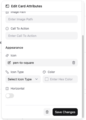 I wanted to change the icon to “thumbs-up”, so I clicked on the input and removed the initial “pen-to-square” value. I started typing “thumbs” hoping for some kind of autocomplete or preview.
Since there was no autocomplete or preview I had to open a new tab, navigate to the FontAwesome website, and search for a thumbs-up icon so I could copy the icon name into the input field. After typing the full icon name, a preview showed on the left side of the input. It was not until I clicked this icon that the preview/autocomplete field showed up. This functionality should be applied to the icon input!
After changing making changes to all the content on the page, there was only one more icon I wanted to change. While searching for relevant icons, I decided not to make any changes. The only options on this menu are “Save Changes” and a trash can button.
I wanted to change the icon to “thumbs-up”, so I clicked on the input and removed the initial “pen-to-square” value. I started typing “thumbs” hoping for some kind of autocomplete or preview.
Since there was no autocomplete or preview I had to open a new tab, navigate to the FontAwesome website, and search for a thumbs-up icon so I could copy the icon name into the input field. After typing the full icon name, a preview showed on the left side of the input. It was not until I clicked this icon that the preview/autocomplete field showed up. This functionality should be applied to the icon input!
After changing making changes to all the content on the page, there was only one more icon I wanted to change. While searching for relevant icons, I decided not to make any changes. The only options on this menu are “Save Changes” and a trash can button.
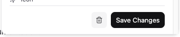 I didn’t want to save the changes so I clicked on the trash can button. This removed the entire card. It turns out the only way to discard changes is by clicking off the pop-up menu. I figured I could just undo this, right? Nope. I had to discard all my changes to the page and start over from scratch.
The UI/UX in the web editor is not ideal.
The buttons in the footer of this menu can be changed to “Discard Changes” and “Save Changes”, and the trash can button can be moved to the header with an added confirmation alert. This provides enough information to the user where change history and undo functionality is not necessary because the events tied to each button are made clear.
I didn’t want to save the changes so I clicked on the trash can button. This removed the entire card. It turns out the only way to discard changes is by clicking off the pop-up menu. I figured I could just undo this, right? Nope. I had to discard all my changes to the page and start over from scratch.
The UI/UX in the web editor is not ideal.
The buttons in the footer of this menu can be changed to “Discard Changes” and “Save Changes”, and the trash can button can be moved to the header with an added confirmation alert. This provides enough information to the user where change history and undo functionality is not necessary because the events tied to each button are made clear.
Global Settings
Eventually I found additional information about icons in the core configuration -> global settings -> reference -> customization -> icon page.
This mentioned the icon library is specified in the docs.json file and is a required property. This is confusing because none of the themes or starter templates include this property.
Even when I changed this to specify Lucide icons, FontAwesome icon names are still used in both the rendered documentation pages and web editor, and an unknown style different from both is also still used.
Documentation
The documentation content is open-source, and upon looking at the icon related files I discovered both the icons-optional.mdx and icons-required.mdx files are exactly the same, and neither contain all the information relating to their usage. It is also unclear why there are 2 separate files containing the same exact content.
These were added with this pull request: https://github.com/mintlify/docs/pull/971
Improvements
Update the Icon page in the documentation to explain how to specify which library.
Update the web editor UI/UX for updating card/icon data.
Debug why the icon doesn’t change when the library changes, and why the ‘thumbs-up’ icon is neither FontAwesome or Lucide.
Reconsider if it is necessary to support multiple libraries at this time. It seems the platform was designed for FontAwesome and support for custom SVGs/urls, and adding Lucide icons created unnecessary complexity and challenges for little reward.
I opened a pull request to update the docs here: 1269 

